top of page

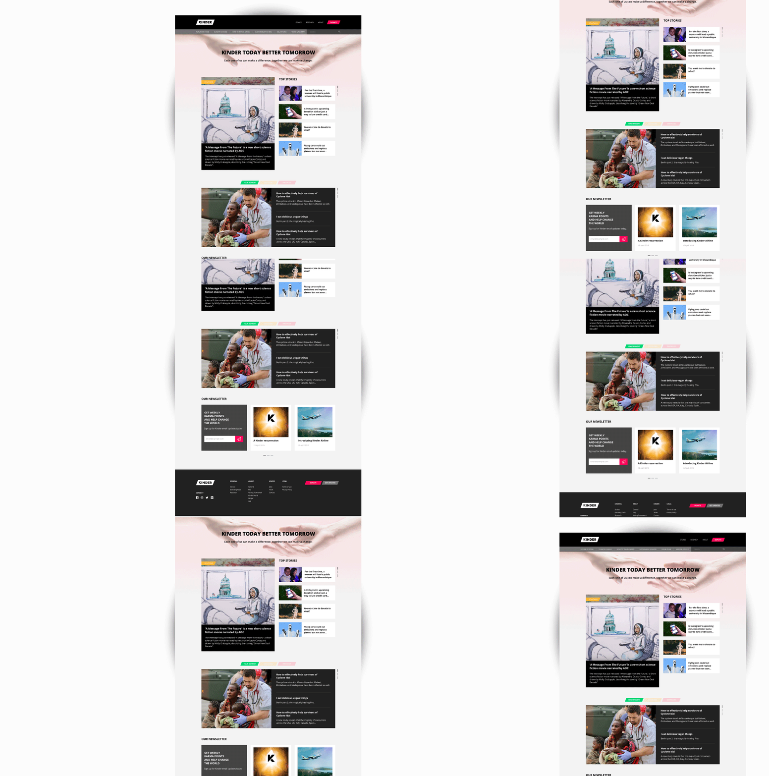
Kinder is an organization that address the world needs & concerns and inspire the public to donate. This is a personal project.
www.kinder.world


Hiccup
After a run through their current website, I've noticed a few problems.
The landing page doesn't look aesthetically pleasing. Their main story has a title with a big slab of box in black. And there is no "Donation" button in view.
Solution
Since Kinder addresses world issues, I designed it in a reportage grid style. The top section is designed in a manner of fluidity and by psychologically reading style left - right. The main content is on the left on the bigger box while others on smaller grid box on the right. The headline is also detached from the image.
Adding the "Donation" button on the header for easier access and creates urgency in helping organizations in needs.
Call to Action
Once clicked, a pop up will show the list of Aids/Relief that needs action & attention. It will be re-directed to the information page of the Aids/Relief that leads the user to the call to action which is a donation.


Content layout redesigned for a better user experience that increases the ease of readability.

Charity Organisation Landing Page
I was invited for a design assessment, which is to create a landing page. The goal of this landing page is to address what problem the organisations are trying to solve and how they are trying to solve them. The goal of this specific page is to get people to sign a petition.
The concept was to give a visual data on the information given. The image header with the red slanted box highlighting the image of the child is to translate the call to action.
The problem and solution is unparalleled to give fluidity to the layout and the used the pink to give urgency with the form next to it.
bottom of page